

Key Takeaways
- Wall colour looks different at different times of day — always test paint samples under both daylight and evening light.
- High-saturation colours intensify in small rooms and can feel overwhelming without enough natural light.
- Tone (lightness or darkness) affects perceived room size more than hue does.
- North-facing rooms receive cooler, bluer light that can make warm neutrals appear grey.
- Paint finish (sheen level) interacts with light and changes how a colour reads on the wall.
- Surrounding furnishings and flooring influence colour perception through reflected light.
Tone, Saturation, and Light
In interior colour theory, 'tone' refers to how light or dark a colour is, while 'saturation' describes its intensity or vividness. These two qualities don't exist in a vacuum — the natural and artificial light in a room constantly shifts how both are perceived. Understanding how they interact helps you choose a colour that actually looks the way you intend it to.
Colour appearance is also influenced by a light source's colour rendering index (CRI) and colour temperature (measured in Kelvin), which affect how accurately a paint's pigment reads under that light.
Why Colour Is Never Just Colour
When homeowners pick a paint colour, they're usually responding to how it looks in a store display or on a small chip — a controlled environment with controlled lighting. Back home, that same colour can look entirely different. This isn't a defect in the paint; it's how colour actually works.
Every colour you see is the result of light bouncing off a surface and reaching your eye. Change the light — its direction, intensity, or colour temperature — and you change what you perceive. This is why choosing a wall colour requires understanding three things: its tone (how light or dark it is), its saturation (how vivid or muted it is), and the light conditions specific to your room.
For a broader look at what else shapes your living space before you pick up a brush, the Living Room Refresh Checklist is a useful starting point.
Tone: The Lightness Scale and Its Effect on Space
Tone sits on a spectrum from near-white to near-black. A colour's tone is one of the most powerful spatial tools in interior design, because it directly influences how much light a surface absorbs or reflects.
- Light tones reflect more light, which makes walls feel further away and rooms feel more open. They're especially effective in rooms with limited natural light.
- Mid tones offer more visual interest without the dramatic spatial compression of darker colours. They tend to be the most forgiving across varying light conditions.
- Dark tones absorb light and can make a large, airy room feel more intimate. Used without enough ambient light, though, they can make a room feel heavy rather than cozy.
Tone also interacts with ceiling height. A dark tone on the ceiling pulls it visually downward; a pale ceiling on a dark-walled room maintains an airy feel overhead. These are spatial levers worth testing before finalising any palette.
LRV 0–100
Light Reflectance Value scale used in paint
LRV (Light Reflectance Value) is the standard industry metric indicating how much light a paint colour reflects — 0 is pure black and 100 is pure white — and is listed on most paint data sheets.
90+
CRI rating for accurate colour rendering
Lighting professionals generally recommend bulbs with a CRI of 90 or above for interior spaces where accurate colour perception matters, such as when evaluating wall paint or textiles.
2700K–5000K
Typical range of residential bulb colour temperatures
Consumer LED bulbs span from warm (2700K, similar to incandescent) to daylight (5000K), each rendering paint colours differently — a difference significant enough to alter colour decisions.
Saturation: Intensity Under Different Light
Saturation describes how vivid or pure a colour is. A highly saturated red is bold and electric; a low-saturation red is muted, almost dusty. The critical thing saturation does in a room is amplify — it reacts strongly to light changes throughout the day.
In rooms with ample daylight, higher saturation can look beautiful in the morning and overwhelming by midday. In rooms with limited light, a highly saturated colour may appear richer and more manageable — but test it carefully, because some colours shift dramatically under artificial evening light.
Muted, low-saturation colours — often called 'greyed down' shades — are more stable across changing light. This is why so many interior designers lean toward them for living rooms: they hold up across morning sunlight, overcast afternoons, and lamp-lit evenings without dramatic swings in appearance.
Test Samples Over Several Days
Don't evaluate a paint sample after just one viewing. Live with it for two to three days, observing it in morning light, afternoon sun, overcast conditions, and under your evening lamps. A colour that looks perfect at noon can read very differently at 8 PM. This is one of the most reliable ways to avoid a colour you'll want to repaint in six months.
How Natural Light Direction Changes Everything
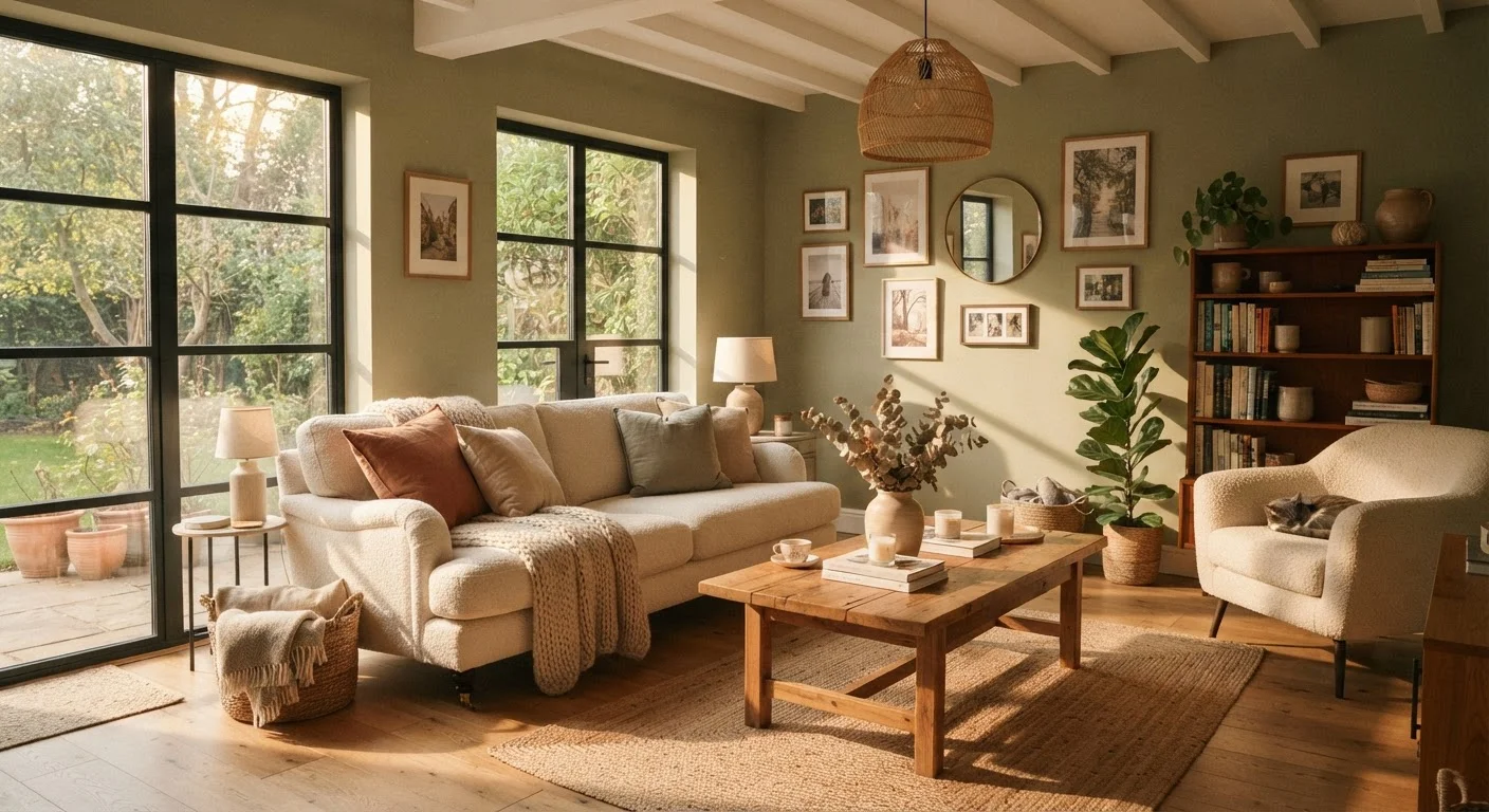
The orientation of your windows determines the quality of light that enters your room — and that quality changes how your chosen colour reads all day long.
- South-facing rooms
- Receive warm, bright light for much of the day. Most colours perform well here, though highly saturated warm colours can feel intense by midday.
- North-facing rooms
- Get cooler, more diffuse light. Warm undertones in paint are often 'corrected' by this light, so a cream may read as grey and a sage can shift greenish-blue. Warmer mid-tones tend to hold better here.
- East-facing rooms
- Get strong, warm morning light that fades to a cooler, flatter light by afternoon. A colour that looks inviting at breakfast may feel flat by evening.
- West-facing rooms
- The opposite of east — cool and dim in the morning, flooded with warm orange light in the late afternoon.
For more on how light myths can steer decisions in the wrong direction, see Natural Light Myths That Are Quietly Shaping Your Living Room Decisions.
Artificial Light and Colour Rendering
Even if your room has good natural light, you'll spend significant time in it after dark — which means artificial lighting plays an equal role in how your colour reads. Two key metrics matter here.
Colour temperature (measured in Kelvin) determines whether a light source reads warm or cool. Bulbs in the 2700K–3000K range emit a warm, yellowish light that flatters warm paint colours but can make cool blues and greys look muddy. Bulbs at 4000K–5000K emit a whiter, more neutral light that reads colours more accurately.
Colour rendering index (CRI) measures how accurately a light source reveals a colour's true pigment. A high-CRI bulb (90+) shows colours closer to how they'd appear in daylight. A low-CRI bulb can make even a carefully chosen paint look flat or off. You can explore these metrics further in this guide to lumens, Kelvin, and CRI.
For practical room-by-room guidance, Living Space Lighting: A Room-by-Room Reference covers placement and fixture types that support your colour choices.
Putting It Together: Practical Steps Before You Paint
Understanding the theory is useful, but the real work happens in your specific room. Here's how to apply these principles practically:
- Paint large sample patches — at least 12 by 12 inches — on multiple walls, including both a wall that catches direct light and one that sits in shade.
- Observe them at different times: morning light, midday, late afternoon, and under your standard evening lighting.
- Note undertone shifts. A 'warm white' may develop a pink tinge under certain lighting. A 'cool grey' may read lavender. These shifts are normal, but they should inform your final decision.
- Factor in your furnishings. Flooring, upholstery, and textiles all reflect colour back onto your walls. A tan sofa and warm wood floors can warm up even a cool-toned paint. See how this plays out in Textiles vs. Hard Furnishings.
- Check your paint finish. A flat finish absorbs light and reads the colour more purely; a semi-gloss reflects light and can intensify a colour. Paint Finishes from Flat to High-Gloss breaks down the full sheen spectrum.
For a comprehensive approach to transforming your living space, The Complete Guide to Planning a Living Room Transformation brings colour, layout, and lighting together in one end-to-end framework.